Monday 27 February 2012

Illustration Friday, or Monday rather -- Fluid

Good morning everyone! I had a busy weekend this week so I apologize for the late post. I feel my excuse is justified though -- I became a first-time aunt on Thursday! Welcome to our family baby girl, Emerson Joy!
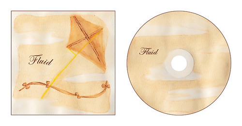
Last week's word was fluid; I wanted to communicate that without tacking the easy route of illustrating a liquid. Instead I focus on 'fluid' meaning elegant, graceful, not settled, and able to change.Change is beautiful isn't it? Creepy-looking caterpillars become butterflies, children become adults; change allows us to reach great heights.

The artist that I took my inspiration from for this piece is Nick Hufford. The objects in this are the only things defining space. They aren't placed in a setting, the create the setting. They aren't placed in front of a background, elements of a traditional background are general shapes forming around the focal points (ie: the single cloud behind the building, or the water below the gondola not flowing past the length of it.)


Here are the concepts I generated. Again, I didn't want to take an easy route and use water as my focus, but the idea had crossed my mind so I jotted a few of those concepts down too to get them out of my system. I chose to develop the bottom left concept with the kite.


I transfered my template onto watercolour paper. *Clever moment -- I used a 'fluid' medium to create this piece! I started by sketching my elements lightly with a brown watercolour pencil. I then laid a wet-wash over the whole thing using Orange Peeko Tea.

I let the wash dry then in the areas that I wanted to stand apart from the background I added more tea simply by painting it over those areas.


Next, to add detail to the kite I used brown watercolour pencils.


I then scanned my painting into my computer on a flatbed scanner and began making edits in photoshop.


Next, I brought my edited image into InDesign to clean-up the edges and add the word 'Fluid'.

Fluid_5-text
This piece was a lot of fun to create, and now I'm back on track to do this week's Illustration Friday. It's going to be a tricky one; the word is Capable.

Monday 13 February 2012

Illustration Friday -- Popularity

Happy Monday everyone! I'm sorry that I didn't post an illustration last week; I was otherwise engaged with a lot of other great projects which I hope to post soon. I've been working on T-shirt designs, Ticket concepts for a Cold Proposal for Universal Republic records, as well as some design work for a student-run Long-boarding Club at McMaster University. Anyway I'm back in the 'IF' saddle and this week's word is popularity. Last week I had hoped to work with charcoal as per Ben Stahl's illustration seen here.

The style he uses generates an uneasy feeling of mistrust. This is kind of what I feel when I think of popularity. Think back to high school; there were always those kids that everyone wanted to be friends with, but those were often the kids that very few people trusted. You were never sure where their loyalties lied or what there motives were. I believe that they too must have, at times, wondered who their true friends were and who was just playing the game.


Here are the concepts I've come up with. I'll keep going with the paparazzi concept. Having a cluster of lenses thrust in the viewer's face, paired with the grungy charcoal effect that Stahl uses, will do a great job of communicating the feeling of tension and suspicion.


For this Album cover I'm going to draw the elements separately and the compile them on the computer. I drew my 2 paparazzi on separate pages in pencil first and then began rendering with the charcoal.


I then scanned my images to begin processing them digitally.


I took the scanned images into Adobe Photoshop and began editing them.

I did some general colour correction, but also greatly enhanced the contrast using Curves and a High-pass filter with a Hard Light blending mode.


Next I began multiplying and arranging the paparazzi using Photoshop.

I also used Photoshop to isolate one lens to use for the CD graphic.


Finally, I took these new images into InDesign and added text. I used a bold sans-serif font to communicate confidence and I used a deep pink colour to 'pop' against the grayscale images behind it. I also included an semi-transparant charcoal coloured block behind the text to make it even more legible.
Popularity_Album Cover